Climalife unveils its new visual identity: a new direction for a better value proposition.
Since 1874, Climalife has been the specialist in thermodynamics and technical fluids for the refrigeration and air conditioning industry. In 2021, brand expanded its scope and now includes the Dehon Group’s fine chemicals offer.
Climalife strengthen its position as leader in working fluids and associated services. And, becomes the expert in eco-efficient solutions to service the industry.
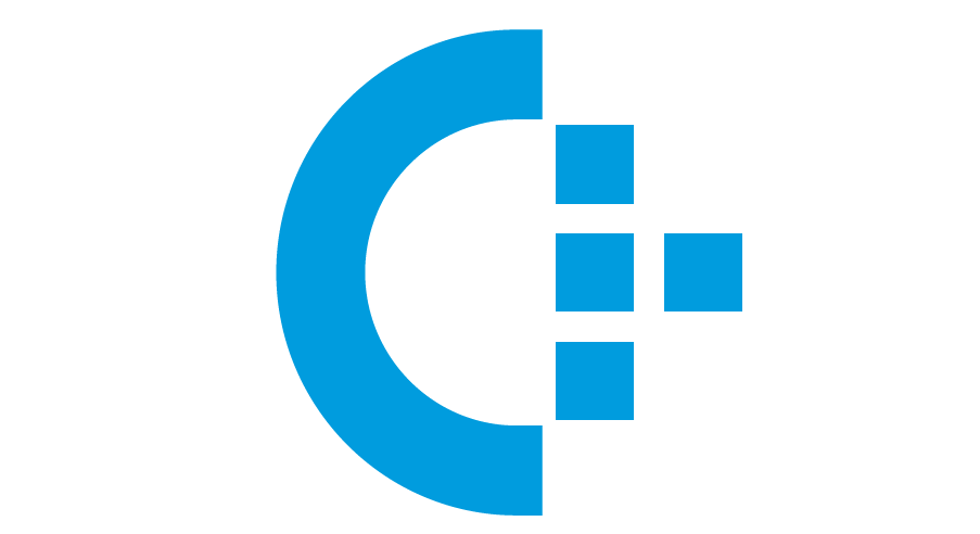
Climalife keeps its emblematic blue logo, a symbol of the commitment to respect the climate and life. A new identity element has been added, consisting of the C for Climalife
The C, which sits as a half globe represents strategic vision. It induces international scope, evokes circularity and represents an open system.
The squares are symbols of:
- Our four strategic pillars
- The future, in the shape of an arrow
- Our value-added services
- Digitalisation
Through this approach, Climalife promises to connect its customers to the eco-efficient industry of tomorrow by strengthening its innovation and responding with agility to the evolution of different markets.